i could go into the levels on which this could cause problems,but i don't feel like it.
so,i'll show some color samples.
this is the panel i made for testing colors while mixing the blue.arriving at the color i did wasn't quite as random as i'd led on.
anyway,the three stripes that barely show are the colors i'm useing for the design.i have at the top green pearl in a blueish binder,the middle one is a blue flake in the same binder,and the bottom is a copper pearl in a clear binder.(binder is the 'meat' of the paint,usually a clear or tinted material that the various pigments,flakes,and pearls are added to to make the final color)
as you can see,the design will be somewhat 'ghosted' over the foundation color,but being pearls will shine out when in direct sunlight.i like the subtlty of doing graphics in this fashion.
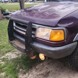
while i was playing around with paint i noticed the taillights were looking pretty beat up.
this is fairly easy to fix up,just sand them smooth with some 320 grit and clearcoat them and they look better than new.as an extra touch i added some copper pearl to the clear...this doesn't show in the photo,but adds a nice glint to them in the light.