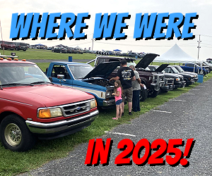
Very Nice - The fonts looks a lot better, but you still need to separate the two lines of text so they are not overlapping. I like Cookie Monsters - the two lines are not touching, and the layer properties (bevel emboss - etc...) look good one them.
The color matching is awesome, but some of them are distracting (mine and another one in gray) looks like you added a Satin Overlay or an Inner Shadow. For the two tones try the main body color for the text and apply a stroke to the text using the other color of the truck.
They do look great with the blurred background, but I am not liking the look of the text - the font is good though.
") Thanks to all you that made suggestions on the font and effects, I appreciate it very much it made them look better
Thanks to all you that made suggestions on the font and effects, I appreciate it very much it made them look better