PDA

View Full Version : for my photoshop class.....


Z3CHYD
05-08-2009, 08:37 AM
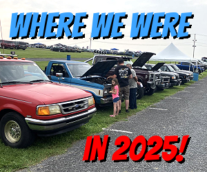
for my photoshop class we have to make a calander with edited pictures fo our choice, for mine of course the theme was Rangers, and I'm using some Rangers that have inspired me on here, and mostly CarDomain. I'll try to get pics of it when im done :)

ranger sport honduras
05-08-2009, 08:53 AM
cool !!

Hazmat Ranger
05-08-2009, 10:42 AM
Yes - sounds cool - now you have to show us since you told us about it - LOL.

Z3CHYD
05-08-2009, 11:19 AM
Yes - sounds cool - now you have to show us since you told us about it - LOL.

o I will, I have ur truck in the cover "collage" it looks cool :)
Your truck is motivating me to make mine look "cleaner" and undo/redo some things the previous owner did

Hazmat Ranger
05-08-2009, 05:58 PM
o I will, I have ur truck in the cover "collage" it looks cool :)
Your truck is motivating me to make mine look "cleaner" and undo/redo some things the previous owner did

:icon_thumby: Cool . . .

Time to :icon_welder: LOL

If I can be of assistance let me know - PS or Mod questions - if I lived closer I would come help ya . . .

nitrofan1
05-08-2009, 06:21 PM
Calendar huh?? Get it ready for 2010 Haz!!! :icon_thumby:

Z3CHYD
05-08-2009, 10:25 PM
Yea so far I have the calendar layout, and all the trucks inserted into the calendar. For the pics, so far i've put each owners name an the year ranger underneath each truck, and sharpened the trucks outlines, and very slightly blurred the background, It looks cool, ill save each pic as a jpeg so i can upload em on here when im done :)

floodz
05-11-2009, 11:47 AM
awesome! cant wait to see it

Z3CHYD
05-13-2009, 08:48 AM
I'll be uploading the cover shortly, its not in any shape or form good, but I'm only in first year photoshop class, which is only 2 months long lol

Z3CHYD
05-13-2009, 08:57 AM
Well here's the Cover, not very good, but the teacher wanted a ~collage~
http://memimage.cardomain.com/ride_images/3/3251/4381/33127190021_large.jpg
(And just to protect my butt, I'm inserting a disclaimer on the back of the calendar that reads: All pictures are of their rightful owners)

Z3CHYD
05-13-2009, 09:11 AM
Here's The Rest :)
http://memimage.cardomain.com/ride_images/3/3251/4381/33127190032_large.jpg
http://memimage.cardomain.com/ride_images/3/3251/4381/33127190033_large.jpg
http://memimage.cardomain.com/ride_images/3/3251/4381/33127190031_large.jpg
http://memimage.cardomain.com/ride_images/3/3251/4381/33127190030_large.jpg
http://memimage.cardomain.com/ride_images/3/3251/4381/33127190029_large.jpg
http://memimage.cardomain.com/ride_images/3/3251/4381/33127190028_large.jpg
http://memimage.cardomain.com/ride_images/3/3251/4381/33127190027_large.jpg
http://memimage.cardomain.com/ride_images/3/3251/4381/33127190026_large.jpg
http://memimage.cardomain.com/ride_images/3/3251/4381/33127190025_large.jpg
http://memimage.cardomain.com/ride_images/3/3251/4381/33127190024_large.jpg
http://memimage.cardomain.com/ride_images/3/3251/4381/33127190023_large.jpg
http://memimage.cardomain.com/ride_images/3/3251/4381/33127190022_large.jpg

Hazmat Ranger
05-13-2009, 10:33 AM
Very Nice work - They all look really good. My "ONLY" suggestion would be a different font. Unless you have other design cues in the Calendar that tie the font into it, such as a horror theme - the dripping letters. I like the font, don't get me wrong, to me it does not seem to fit the theme of the design. I would use one called Magneto, Wild-Ride or Hemi-Head.
Otherwise - very nice - I really like it and would buy one or two . . . good work bro . . .

Roadkill
05-13-2009, 11:00 AM
My suggestion would also be a different font, just doesn't 'work' with the truck theme. Also, I would recommend that you erase the license plates on all the trucks. Just for safety sake.

Otherwise, I like it! Better than I could do that's for sure.

tpking
05-13-2009, 11:07 AM
be awesome if maybe you could blur the backgrounds ..

Z3CHYD
05-13-2009, 11:16 AM
Very Nice work - They all look really good. My "ONLY" suggestion would be a different font. Unless you have other design cues in the Calendar that tie the font into it, such as a horror theme - the dripping letters. I like the font, don't get me wrong, to me it does not seem to fit the theme of the design. I would use one called Magneto, Wild-Ride or Hemi-Head.
Otherwise - very nice - I really like it and would buy one or two . . . good work bro . . .

Are those fonts already in photoshop or do you have to download them? I didn't really look at all the fonts photoshop has to offer, and this isnt the final copy, so keep the suggestions coming, I appreciate all the help guys:icon_thumby:

Z3CHYD
05-13-2009, 01:15 PM
Ok then im in the process of changing the fonts and "tweaking" some of the pics

nitrofan1
05-13-2009, 01:37 PM
Good representation of Gens! Ditto on the font though! :icon_thumby:

Hazmat Ranger
05-13-2009, 01:40 PM
your best friend in the world

www.dafonts.com

check them out - tons of free fonts - I think there is also 1001fonts.com or something.

I like the blur background idea - makes the truck (subject) stand out more. Make a selection around the truck and then ctrl+I to select inverse and gaussian blur. Don't blur it totally, just enough to make the truck the main focus of the image.

Chance
05-13-2009, 02:59 PM
your best friend in the world

www.dafonts.com

check them out - tons of free fonts - I think there is also 1001fonts.com or something.

I like the blur background idea - makes the truck (subject) stand out more. Make a selection around the truck and then ctrl+I to select inverse and gaussian blur. Don't blur it totally, just enough to make the truck the main focus of the image.

Agreed... I sometimes spent hours downloading new fonts at my old job from both those sites... (its 1001freefonts.com I believe)

I'm with hazmat on magneto
I would also recommend the font marcelle (sp?)... its got kinda a baseball shirt feel but I like it with trucks...
Also, I'd round the corners more on the front collage if ya feel like it.

Good work so far :icon_thumby:

Z3CHYD
05-13-2009, 09:08 PM
Ok guys an update, I'm changing the font to Magneto, it just looks neato :) And I'll try my hand at blurring the background a "tad" Check back tomorrow, since I don't have photoshop at home

tpking
05-13-2009, 09:24 PM
glad you took my suggestion about the blur .. to me since the calander subject is rangers they should stand out ...

Hazmat Ranger
05-13-2009, 09:52 PM
Ok guys an update, I'm changing the font to Magneto, it just looks neato :) And I'll try my hand at blurring the background a "tad" Check back tomorrow, since I don't have photoshop at home

Here is how mine would look - I know you are suppose to do the work - but use this one as a guide - I set my blur to 14.8 and got this . . . use the mask tool and zoom in close and paint that mask as close as you can, then invert the selection and blur the BG . . . good luck man - it is looking great so far.
Forgot to edit the plate . . . doh!

http://i29.photobucket.com/albums/c260/rangergt/BlurredBG.jpg

tpking
05-13-2009, 09:57 PM
yea that looks awesome thats what i had in mind when i heard about your project the other day ..

Mtrhd0024
05-14-2009, 06:42 AM
Only just saw this thread but I'm glad you chose to change the font, I agree it didn't fit the theme very well. I like the blurred background, looks pretty cool, although in some cases where the background was carefully chosen, i.e. in Baby Harleys photo, it would kinda be a shame to blur it out.

The other thing is you can use the gaussian blur to blur the license plate effectively without it being just a plain white rectangle or something like that.

So Hazmats Ranger would look like this:

http://www.therangerstation.com/forums/attachment.php?attachmentid=2031&d=1242301226

As opposed to this:

http://www.therangerstation.com/forums/attachment.php?attachmentid=2032&d=1242301233

I think the white blob is just too intrusive lol! And the blur is really just about as easy to do!

Z3CHYD
05-14-2009, 06:46 AM
Yea I see what you all mean about the blur, I'll blur certain ones, and others ill just edit out the liscense plates. Thanks for all the help guys, i love that in my photoshop class we can pick what we want to work on, so it doesnt [I]feel[I] like I'm doing work :)

Z3CHYD
05-14-2009, 09:00 AM
Ok then here's Haz's, I used Gaussian blur, and set it to about 2.3 so its not overly blurred, but makes the truck stand out more, now I have eleven more to do :)
http://memimage.cardomain.com/ride_images/3/3251/4381/33127190034_large.jpg

ranger sport honduras
05-14-2009, 09:16 AM
nice work!!! post up the final version when u are done

Hazmat Ranger
05-14-2009, 09:39 AM
Looking good - but I am biased in my decision LOL.

One more suggestion - lower the height of the bevel and emboss to about half of that - it distorts the text a bit too much and add a small drop shadow to it, will help it stand off the page a bit.

Otherwise great job . . . - do we get credit on the last page for suggestions or something - ROFL - just kidding, the truck in there is cred enough . . .

Hazmat Ranger
05-14-2009, 09:47 AM
Something like this - just my opinion/suggestion:

http://i29.photobucket.com/albums/c260/rangergt/MagnetoText.jpg

You would need to separate the line spacing a bit more since the lower letters are overlapping the top ones. Look on the character/paragraph palette for a icon that looks like an A over another A and has an adjustment box next to it - default says Auto - play with that to get better spacing.:icon_thumby:

Z3CHYD
05-14-2009, 10:12 AM
Something like this - just my opinion/suggestion:

http://i29.photobucket.com/albums/c260/rangergt/MagnetoText.jpg

You would need to separate the line spacing a bit more since the lower letters are overlapping the top ones. Look on the character/paragraph palette for a icon that looks like an A over another A and has an adjustment box next to it - default says Auto - play with that to get better spacing.:icon_thumby:

I'll have to check when i get home at the pics your showing me since photobucket is blocked at school. I jjust uploaded my pics to my cardomain page, its easier to me

ranger sport honduras
05-14-2009, 10:16 AM
one tip, u should match the title colors to the trucks colors, so it would look more combined, if hazmat is white with black, use the same colors on the title
good work!

Z3CHYD
05-15-2009, 08:18 AM
yea I might do that when i'm all done changing the fonts and adding a shadow to the letters

Z3CHYD
05-15-2009, 08:38 AM
Ok I'm almost done, I'll upload the pics shortly, if all goes well an my cp doesnt freeze again

Z3CHYD
05-15-2009, 11:16 AM
OK here they are as of now, I still have to edit the liscense plate on a coupe of em, and some tweaks here an there, but I'm gettin there :) Thanks to all you that made suggestions on the font and effects, I appreciate it very much it made them look better :)
http://memimage.cardomain.com/ride_images/3/3251/4381/33127190038_large.jpg
http://memimage.cardomain.com/ride_images/3/3251/4381/33127190035_large.jpg
http://memimage.cardomain.com/ride_images/3/3251/4381/33127190036_large.jpg
http://memimage.cardomain.com/ride_images/3/3251/4381/33127190037_large.jpg
http://memimage.cardomain.com/ride_images/3/3251/4381/33127190039_large.jpg
http://memimage.cardomain.com/ride_images/3/3251/4381/33127190040_large.jpg
http://memimage.cardomain.com/ride_images/3/3251/4381/33127190041_large.jpg
http://memimage.cardomain.com/ride_images/3/3251/4381/33127190042_large.jpg
http://memimage.cardomain.com/ride_images/3/3251/4381/33127190043_large.jpg
http://memimage.cardomain.com/ride_images/3/3251/4381/33127190044_large.jpg
http://memimage.cardomain.com/ride_images/3/3251/4381/33127190045_large.jpg
http://memimage.cardomain.com/ride_images/3/3251/4381/33127190046_large.jpg
http://memimage.cardomain.com/ride_images/3/3251/4381/33127190047_large.jpg

tpking
05-15-2009, 11:17 AM
freakin awesome the blurred background looks better than i ever thought

Z3CHYD
05-15-2009, 11:26 AM
freakin awesome the blurred background looks better than i ever thought

Yea I only blurred them ever so slightly, so the rangers stand out but you can still see the background :) I agree that matching the font to the color of the trucks was a wise decision

Hazmat Ranger
05-15-2009, 12:31 PM
Yea I only blurred them ever so slightly, so the rangers stand out but you can still see the background :) I agree that matching the font to the color of the trucks was a wise decision

Very Nice - The fonts looks a lot better, but you still need to separate the two lines of text so they are not overlapping. I like Cookie Monsters - the two lines are not touching, and the layer properties (bevel emboss - etc...) look good one them.

The color matching is awesome, but some of them are distracting (mine and another one in gray) looks like you added a Satin Overlay or an Inner Shadow. For the two tones try the main body color for the text and apply a stroke to the text using the other color of the truck.

They do look great with the blurred background, but I am not liking the look of the text - the font is good though.

ranger sport honduras
05-15-2009, 07:18 PM
its getting better!!
fix the tittle its calendar u have calander :icon_thumby:

Brandon12
05-15-2009, 08:18 PM
Looks great. You oughta try to two tone baby harleys name like you did in the last picture with the black/silver mix. Just my 2 cents. I would get some other opinions first. :icon_thumby:

Mtrhd0024
05-15-2009, 08:28 PM
Looks real good, the blurred backgrounds really do help the trucks to stand out a little bit more, and matching the font color to the truck looks good!!

I'm still not big on that font personally, but I know you've made shadows and such to match so don't change it now. If you like it thats all that matters, just my opinion.

Really like the one of 85 Bagged Rangers truck. The blurred background and nicely framed shot makes that one really look nice. Lookin good man!

Z3CHYD
05-15-2009, 10:06 PM
Very Nice - The fonts looks a lot better, but you still need to separate the two lines of text so they are not overlapping. I like Cookie Monsters - the two lines are not touching, and the layer properties (bevel emboss - etc...) look good one them.

The color matching is awesome, but some of them are distracting (mine and another one in gray) looks like you added a Satin Overlay or an Inner Shadow. For the two tones try the main body color for the text and apply a stroke to the text using the other color of the truck.

They do look great with the blurred background, but I am not liking the look of the text - the font is good though.

Yea I'll separate the text on monday when I'm back in school. that was something i overlooked, i'll have that fixed, and maybe tweak some of the text colors like you suggested, thanks for the help hazmat and everyone :icon_thumby:

Z3CHYD
05-18-2009, 08:39 AM
Ok I edited it again so all the font isnt overlapping, and some of the font isnt distracting, like you said hazmat, i had an outer glow on some of them, so i just removed it, and they all look better now. i dont think i need to resave all 13 pics and reupload all of the to my cardomain again to show u all again tho lol its not that different from the last post cept cleaned up

Hazmat Ranger
05-18-2009, 08:43 AM
But you WILL upload the final project . . .


Please . . . LOL

Z3CHYD
05-18-2009, 08:56 AM
But you WILL upload the final project . . .


Please . . . LOL

^of course :D